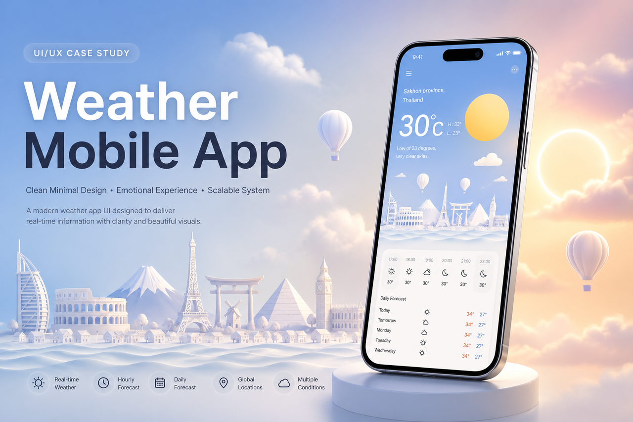
Overview
This project explores a modern weather mobile application interface that balances usability and emotional design. The goal is to transform weather data into a visually engaging and easy-to-understand experience.
Problem
Many existing weather apps are overloaded with information, making them difficult to scan quickly. They often lack emotional engagement and fail to visually represent the atmosphere of each weather condition.
Goal
- Deliver key weather information within 3 seconds
- Improve readability and visual hierarchy
- Create emotional engagement through visual design
- Build a scalable UI system for multiple weather conditions
Design Approach
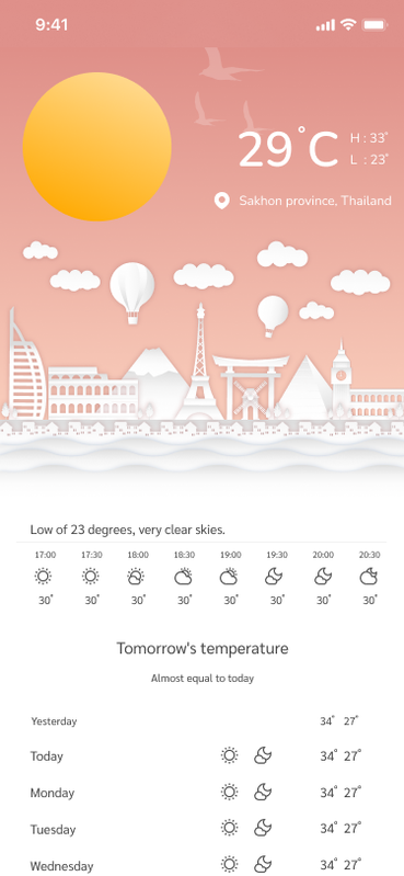
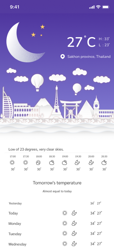
1. Visual Storytelling
Each weather condition is represented using a unique combination of:
- Color mood (temperature-based)
- Sky elements (sun, moon, clouds, rain, snow)
- Background illustration for atmosphere
2. Minimal UI Structure
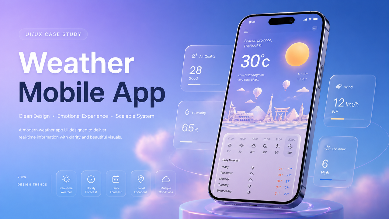
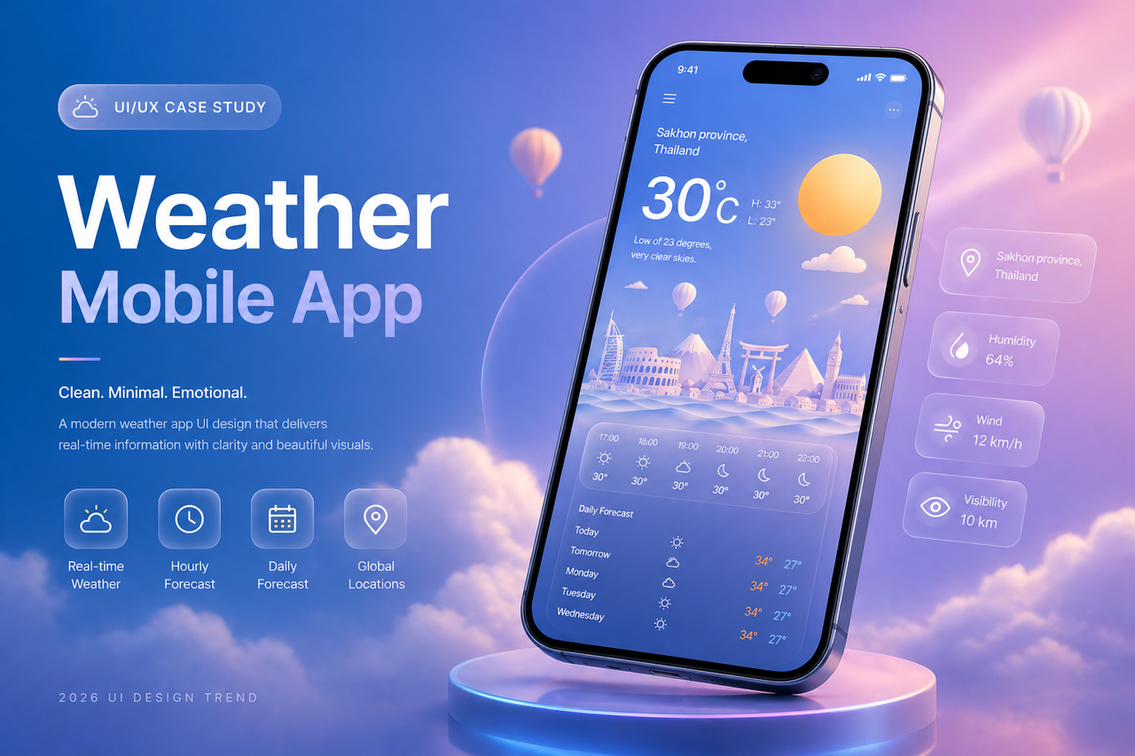
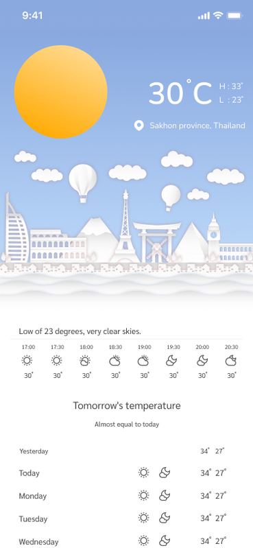
The interface focuses only on essential data:
- Current temperature (primary focus)
- Location
- High / Low temperature
- Hourly and daily forecast
Unnecessary elements were removed to reduce cognitive load.
3. Consistency System
All screens follow the same layout structure.
Only these elements change:
- Background color
- Weather icon
- Decorative elements
This ensures scalability and design efficiency.
Design System
Color Strategy
- Day: Soft blue gradient
- Sunset: Warm orange tone
- Night: Deep purple
- Rain: Dark navy
- Snow: Desaturated cold blue
Typography
- Large temperature text for primary focus
- Secondary data uses lower contrast
- Clean sans-serif for readability
Key Screens
- Sunny (Day Mode)
- Sunset Mode
- Night Mode
- Rain Mode
- Snow Mode
Outcome
- Improved readability and faster information scanning
- Strong visual identity
- Ready for real-world application and scaling
What I Learned
- Simplicity improves usability significantly
- Emotional design increases user engagement
- A strong design system reduces long-term complexity
🔗 Resources & DownloadTo support designers and developers, this project is also available as a free UI kit. You can explore the full design system, components, and layouts directly in Figma.
👉 Download the full UI kit here:
https://www.figma.com/community/file/1237057234092490681/weather-mobile-app-ux-ui-design-free-ui-kit