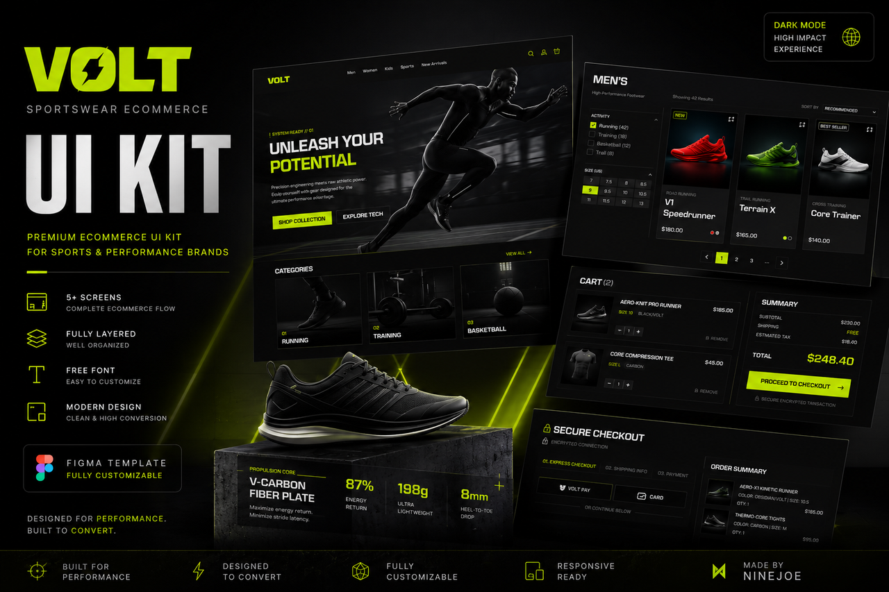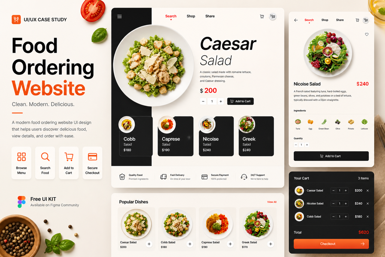
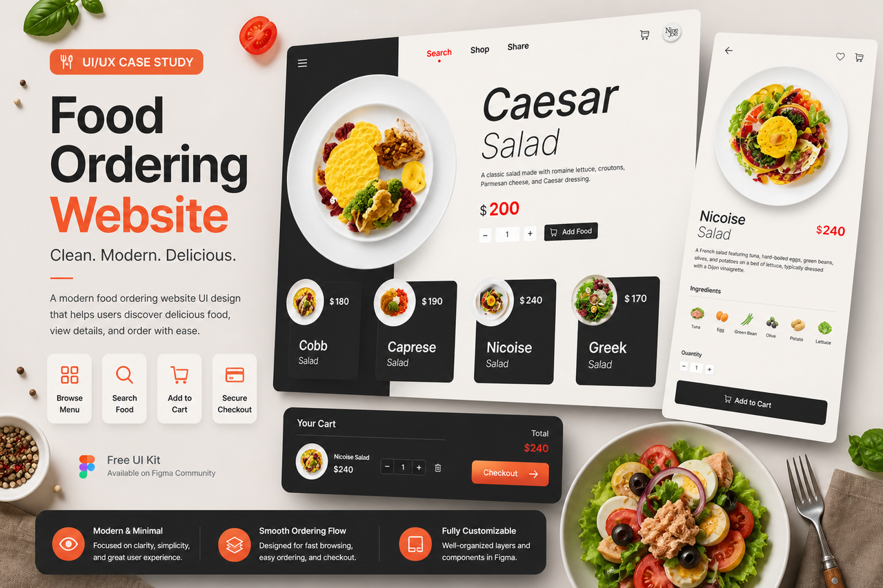
Overview
This project explores the design of a food ordering website that enhances user experience through simplicity and strong visual presentation. The interface is optimized for browsing menus, viewing product details, and placing orders efficiently.
Problem
Many food ordering websites suffer from cluttered layouts and unclear navigation, making it difficult for users to quickly find items and complete purchases. This often leads to drop-offs during the ordering process.
Goal
- Improve product discoverability
- Simplify the ordering process
- Create clear visual hierarchy
- Enhance usability across web platforms
Design Approach
1. Visual Hierarchy First
- Large food images to attract attention
- Clear product titles and pricing
- Highlighted CTA (Add to cart)
2. Clean & Structured Layout
- Grid-based product display
- Minimal distractions
- Balanced spacing for readability
3. Efficient User Flow
The experience is streamlined into:
- Browse menu
- View product detail
- Add to cart & order
Key Features
- Product grid layout
- Detail page with description & pricing
- Add-to-cart interaction
- Category navigation (Search / Shop / Share)
- Clean and modern UI system
Outcome
- Faster decision-making for users
- Improved readability and navigation
- Scalable design for real-world e-commerce
🔗 Resources & Download
Explore the full UI kit here:
👉 https://www.figma.com/community/file/1303394577755628974/food-ordering-website-ux-ui-design-free-ui-kit