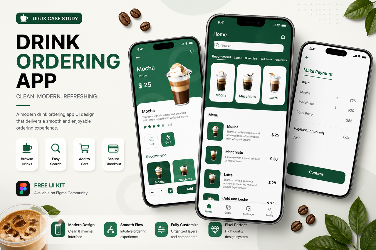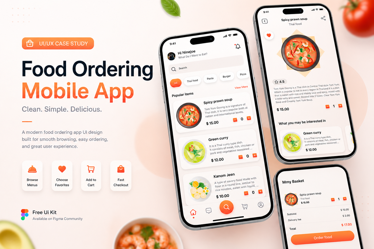
Overview
This project explores the design of a food ordering mobile application with a focus on usability and visual clarity. The interface is designed to help users quickly browse menus, view food details, and place orders seamlessly.
Problem
Food ordering apps often contain too many steps and cluttered interfaces, making it difficult for users to quickly find and order meals. In a competitive market, simplicity and speed are key factors for user retention.
Goal
- Simplify the ordering process
- Improve visual hierarchy
- Create a smooth and intuitive user flow
- Enhance user engagement through clean UI
Design Approach
1. Clean & Minimal Layout
The interface focuses on essential elements only:
- Food image
- Name & description
- Price
- Quick add-to-cart interaction
2. User-Friendly Flow
The ordering journey is optimized into 3 main steps:
- Browse menu
- View details
- Add to cart & checkout
This reduces friction and speeds up decision making.
3. Visual Hierarchy
- Large food images to attract attention
- Clear pricing display
- Highlighted CTA buttons for ordering
Key Features
- Category filtering (Thai food, pasta, burger, etc.)
- Popular items section
- Product detail page
- Add to cart interaction
- Bottom navigation for quick access
Outcome
- Faster ordering experience
- Clean and modern UI
- Scalable for real-world food delivery apps
🔗 Resources & Download
You can explore and use the full UI kit here:
👉 https://www.figma.com/community/file/1225111518224017126/food-ordering-mobile-app-ux-ui-design-free-ui-kit
💡 What I Learned
- Simplicity improves conversion rate
- Clear hierarchy reduces user effort
- Good UX = faster decisions